Nexadental

Nexadental, AfterNexadental originally approached us for social media help, but it quickly became apparent that the entire brand and marketing direction of Nexadental was at a marketing turning point.

Nexadental and sister company, Orthoquest, are a combined wholesaler of dental supplies internationally. Their centerpiece product, QBrush is a consumable dental product with multiple sales channels.

The first major step was developing a strategic marketing plan. Researching how to take Nexadental away from products that supported older technology – products their customers were buying less and less of. And – developing a new strategy to move Nexadental’s product mix into more high profit and quicker sales channels.

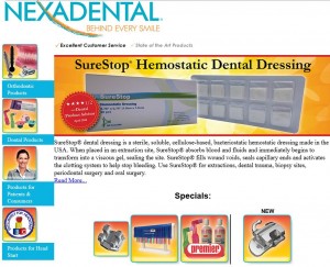
One major step was to redevelop the logo for Nexadental. The challenges included selecting colors for a professional dental audience and translates to their patients. Another challenge is the photos they use tend to be medical equipment or equipment in use (mouth shots), so the colors had to stand up and compliment their product offerings. The colors were chosen with color research, competition research and talented design. The teal is a common medical color matched with the orange gave Nexadental a fresh new look that appeals to their audience. Their in-house graphic designers found with use over time that the colors chosen are flexible for all uses. They have changed the complimentary colors based on season and use successfully and easily.

During the strategic planning process key areas of need were identified. Strategic plans were developed. And, implemented by eGrowth Marketing were appropriate.

  1. There was no SWOT analysis of the company or its competition.
  2. Logo and marketing approach was dated.
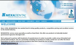
  3. Website was brochure only and needed to move to ecommerce.
  4. Sales force was evaluated and trained.
  5. Manufacturing and private labeling were expanded.

BEFORE

Nexadental, Before


Five Oaks Luxury Real Estate

The Five Oaks project for The Jansen Team posed a unique challenge in the way it deviated widely from their regular branding. The Jansen Team came to us with a listing for a multi-million dollar looking for additional support in the unique marketing needs of such a property. Our objective was to give the property its own branding that could reside along side The Jansen Team’s on the website as well as live outside that context in a high-end photo booklet. The name “Five Oaks” was given to the property, as well as branding iconography that spoke to the expansive natural setting of the property. This gave The Jansen Team a framework within to market the property to a specific audience.

cover

pre1

pre2

Pacific West Apartments

Pacific West Premier MailerThe circumstances around Pacific West Apartments called for a unique and nuanced marketing strategy.  The new owners of the property took the existing units into a significant remodeling while brand new buildings were being constructed. Pacific West now had two different products in one apartment complex, supported with common amenities. The challenge was to convey the difference between the new and old buildings without one diminishing the appeal of the other. With the remodeled units priced lower than the new units, we first implemented a campaign to encourage existing residents to sign leases in the new buildings. We were successful in maximizing on the built-in audience we already had, filling many of the new units. The next wave was to open up advertising to outside parties. We created a brand and vocabulary for each of the products–differentiating them while playing up their individual appeal. The new units were called “Pacific West Premier” and the remodeled unites were called “Pacific West Classic.” The copy on signs and billboards tied the two products together announcing “A New Direction for Pacific West” defining this apartment complex as a unique apartment living community with different options for different lifestyles. The marketing materials also visually connected the two products with a specifically chosen compass. Advertising included new outdoor signage, TV, radio, kiosk signage in the local mall, and social media. End result was a successful lease up to over 97% across properties – even with impending road construction on the main intersection.

 Cable TV Ad for the Omaha market


Oakview Mall Sign Display Ad placed at Oakview Mall in Omaha


post card 2Postcard Sent to a Specified List of Potential Residents